The Vesmir COVID-19 Dashboard digests COVID-19 information in a consistent way based on recommendations from the CDC, State of Colorado, and Harvard University. Comparison of incidence rates, incidence rate trends, and death rates provides improved understanding of COVID-19 risk from community to country scale for travel planning and policy making.
This page will step through the key map types on the Vesmir COVDI-19 Dashboard: Travel Maps, Trend Maps, Change Maps, and Cumulative Maps. All of these use the same metrics for counties and countries, as shown on the Vesmir COVID-19 Dashboard.
Need more than you see here? Reach out to us on Twitter @VesmirInc.
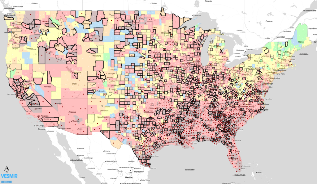
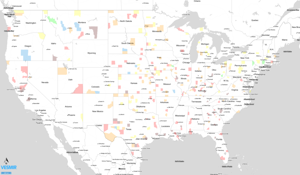
The COVID-19 Travel Maps show three key metrics on one map: Incidence Rate Class, Incidence Rate Trends, and Death Rate Class.
The COVID-19 Travel Maps are based on data from Johns Hopkins University for the two weeks prior to the Report Date. We use a two-week period for a couple of reasons:
The three layers of the COVID-19 Travel Map are:
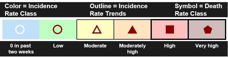
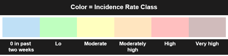
Incidence Rate Class (Two-Week Cumulative Incidence Rate Class): A color fill indicating the number of new cases per 100,000 people in the two-week period. The value is the sum of each county’s number of reported cases in the past two weeks (in other words, the difference between the total number of cases from two weeks ago from the current total number of cases) divided by that region’s population. The resulting rate is multiplied by 100,000 to get a two-week cumulative incidence rate per 100,000 people.
0 cases past two weeks/blue: No confirmed cases reported in the past two weeks.
Low/green: There have been 10 or fewer new cases per 100,000 people in the past two weeks. 10 per two weeks is 0.71 new cases per day per 100,000 people.
Moderate/yellow: There have been between 10 and 50 new cases per 100,000 people in the past two weeks. 50 per two weeks is 3.57 new cases per day per 100,000 people.
Moderately high/orange: There have been between 50 and 100 new cases per 100,000 people in the past two weeks. 100 per two weeks is 7.14 new cases per day per 100,00 people.
High/red: There have been between 100 and 350 new cases per 100,000 people in the past two weeks. 350 per two weeks is 25 new cases per day per 100,000 people.
Very high/deep red: There have been more than 350 new cases per 100,000 people in the past two weeks, which is 25 new cases per day per 100,000 people.
Incidence Rate Trends (Two-Week Incidence Rate Trends): An outline for areas indicating how quickly new cases are growing.
The light outline is for areas with growth in new cases of between 6 and 30 per 100,000 people per week. Areas without an outline may be relatively stable or have declining incidence rate trends.
The bold outline is for areas growing at a rate of more than 30 new cases per 100,000 people per week.
Death Rate Class (Two-Week Cumulative Death Rate Class): A symbol for each area to indicate deaths per 100,000 people in the past two weeks.
0 deaths past two weeks/White circle: No deaths reported in the past two weeks
Low/open maroon circle: There have been less than 0.6 deaths per 100,000 people in the past two weeks.
Moderate/open maroon triangle: There have been between 0.6 and 3 new deaths per 100,000 people in the past two weeks.
Moderately high/filled maroon triangle: There have been between 3 and 6 new deaths per 100,000 people in the past two weeks.
High/filled maroon square: There have been between 6 and 21 new deaths per 100,000 people in the past two weeks.
Very high/filled maroon square: There have been more than 21 new deaths per 100,000 people in the past two weeks.
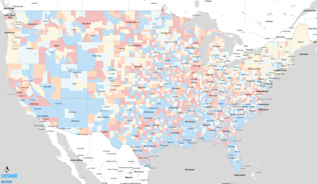
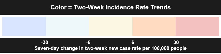
The COVID-19 Trend Maps show how quickly a particular attribute changes with time. This example uses the two-week cumulative incidence rate and compares the current two-week cumulative incidence rate to the rate one week ago. The result is how quickly incidence rates are rising or falling.
For example, if an area is rising at more than 30 new cases per 100,000 per week, it will show on these maps in red. That sort of increase is quite substantial as that would move an area from no cases to the moderate incidence rate class in a single week.
The COVID-19 Change Maps show how a particular attributes changes over a given time period. This example shows the areas that have changed their two-week incident rate class in the past day, thus focusing on where key changes are happening.
Note that only counties have that have changed class in the past day are colored.
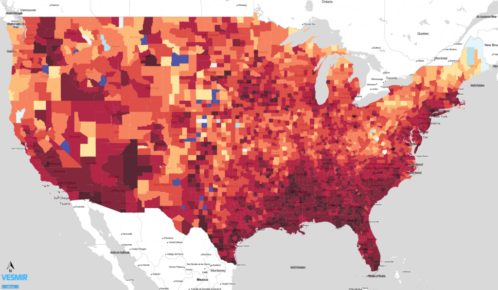
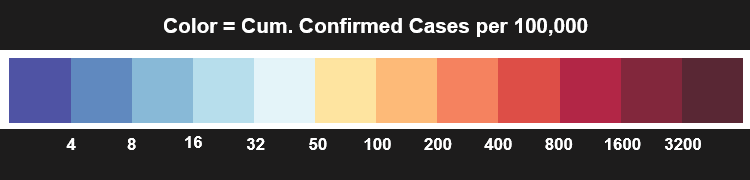
The COVID-19 Cumuative Maps show how many total cases or deaths per 100,000 people have been observed in an area over the course of the entire pandemic. These maps are used to compare total impact between areas.
This particular example is for cumulative confirmed cases per 100,000 people for counties in the US. Notice that we use the same color bar for countries as well, so you can get a feel for how various countries compare to counties in the US.
We will likely need to update this legend in time, as much of the US is at the high-end of the spectrum already.
See these maps in action on the Vesmir COVID-19 Dashboard.
Need more? Reach out to us on Twitter @VesmirInc.